Today I will briefly show you how to make in a few steps nice icons with Inkscape.
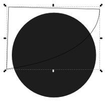
First we open Inkscape and characterized e.g. a circle. You can also take another form. Next, we duplicated the circle (Ctrl + D) and move it to another place. Hold down the Ctrl key, the horizontal / vertical orientation should be the same.

Now we worked the second circle with the path tool (Shift + F6) that an arc arises. The arc is the important thing in our Icon. Otherwise, the path must be closed, ie at the beginning point again.

Then you mark the circle and the path (hold down Shift) and select in the path menu Interchange section. The remaining piece will now be colored white and shelved back again on the first circle.
The next step is to adjust the opacity. To create a „glass effect“ to obtain coverage should be between 20% and 30% – according to your taste.

Now you need only a symbol or text at the circle. Here you should make sure that the icon or text layer is between the „circles“. Now, we actually already finished, but the icon can be a little blur at the edge adding. This fits the fuzziness at the first circle.

So … that’s it already. The icon is finished!
In the german wiki article you will find many more links to tutorials, which are worth a look.